Bear Blog form styles
The default Bear Blog theme leaves forms mostly unstyled, browser defaults for inputs, textareas, and buttons. A few small rules make them feel like part of the page.
This page collects small CSS tweaks and variations for forms. Each one works out of the box, but they're just as much meant as a starting point. Mix and match, tweak the values, or use them to learn more about theme styling.
Last updated 1 month, 1 week ago.
Basic form styles
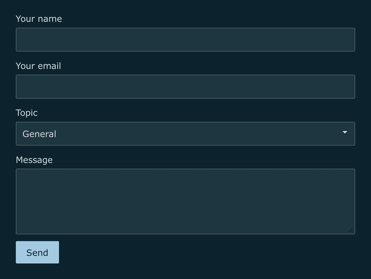
input,
textarea,
select {
    display: block;
    width: 100%;
    margin-block-end: 0.8em;
    padding: 0.5em 0.7em;
    border: 1px solid color-mix(in srgb, var(--text-color), transparent 70%);
    border-radius: 4px;
    background: var(--background-color);
    color: var(--text-color);
    font: inherit;
}

input:focus-visible,
textarea:focus-visible,
select:focus-visible {
    outline: 2px solid var(--link-color);
    outline-offset: 2px;
}

button,
input[type="submit"] {
    padding: 0.5em 1.2em;
    border: none;
    border-radius: 4px;
    background: var(--link-color);
    color: var(--background-color);
    font: inherit;
    font-weight: 500;
    cursor: pointer;
}

@media (hover: hover) {
    button:hover,
    input[type="submit"]:hover {
        background: color-mix(in srgb, var(--link-color), black 15%);
    }
}
Underlined fields and pill button
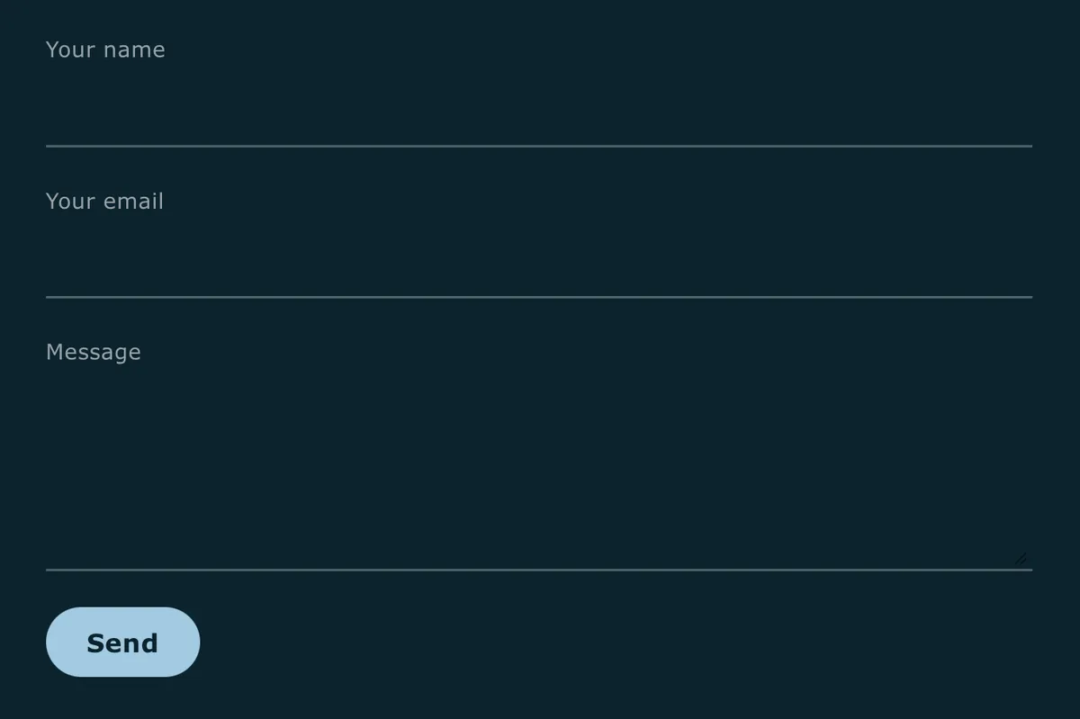
form p {
    margin: 0;
}

label {
    display: block;
    margin-block-end: 0.4em;
    font-size: 0.85em;
    font-weight: 500;
    letter-spacing: 0.02em;
    color: color-mix(in srgb, var(--text-color), transparent 30%);
}

input,
textarea {
    display: block;
    width: 100%;
    margin-block-end: 1.4em;
    padding-block: 0.6em;
    border: none;
    border-block-end: 1.5px solid color-mix(in srgb, var(--text-color), transparent 65%);
    background: transparent;
    color: var(--text-color);
    font: inherit;
    transition: border-color 0.2s ease;
}

input:focus-visible,
textarea:focus-visible {
    outline: none;
    border-block-end-color: var(--link-color);
    border-block-end-width: 2px;
}

button,
input[type="submit"] {
    padding: 0.6em 1.6em;
    background: var(--link-color);
    border: none;
    border-radius: 999px;
    color: var(--background-color);
    font: inherit;
    font-weight: 600;
    letter-spacing: 0.02em;
    cursor: pointer;
    transition: transform 0.15s ease, background 0.15s ease;
}

@media (hover: hover) {
    button:hover,
    input[type="submit"]:hover {
        background: color-mix(in srgb, var(--link-color), black 15%);
        transform: translateY(-1px);
    }
}

@media (prefers-reduced-motion: reduce) {
    input,
    textarea,
    button,
    input[type="submit"] {
        transition: none;
    }

    button:hover,
    input[type="submit"]:hover {
        transform: none;
    }
}
Card form
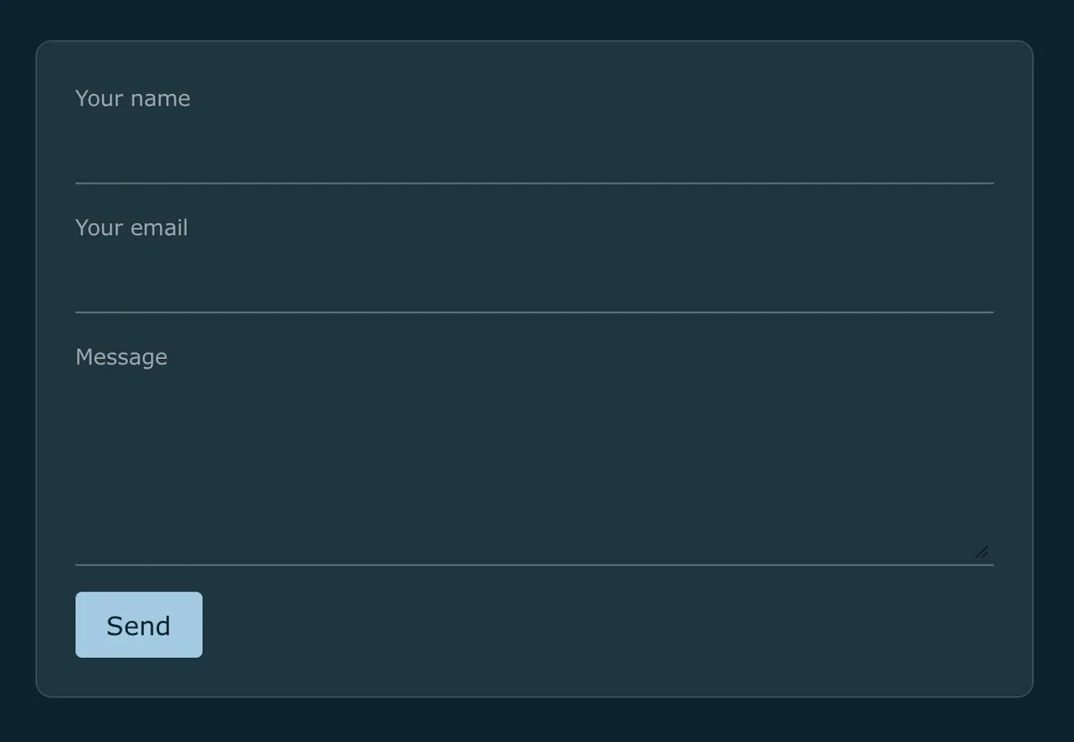
form {
    padding: 1.5em;
    margin-block: 1.5rem;
    background: var(--code-background-color);
    border: 1px solid color-mix(in srgb, var(--text-color), transparent 85%);
    border-radius: 10px;
}

form p {
    margin: 0;
}

label {
    display: block;
    margin-block-end: 0.3em;
    font-size: 0.85em;
    font-weight: 500;
    color: color-mix(in srgb, var(--text-color), transparent 30%);
}

input,
textarea {
    display: block;
    width: 100%;
    margin-block-end: 1em;
    padding-block: 0.4em;
    border: none;
    border-block-end: 1px solid color-mix(in srgb, var(--text-color), transparent 60%);
    background: transparent;
    color: var(--text-color);
    font: inherit;
}

input:focus-visible,
textarea:focus-visible {
    outline: none;
    border-block-end-color: var(--link-color);
}

button,
input[type="submit"] {
    padding: 0.5em 1.2em;
    background: var(--link-color);
    border: none;
    border-radius: 4px;
    color: var(--background-color);
    font: inherit;
    font-weight: 500;
    cursor: pointer;
}

@media (hover: hover) {
    button:hover,
    input[type="submit"]:hover {
        background: color-mix(in srgb, var(--link-color), black 15%);
    }
}
Buttons
A few more options for the submit button, mix and match with any of the field styles above.
Outline button

button,
input[type="submit"] {
    padding: 0.5em 1.2em;
    border: 1px solid var(--link-color);
    border-radius: 4px;
    background: transparent;
    color: var(--link-color);
    font: inherit;
    font-weight: 500;
    cursor: pointer;
}

@media (hover: hover) {
    button:hover,
    input[type="submit"]:hover {
        background: color-mix(in srgb, var(--link-color), transparent 90%);
    }
}
Underline button

button,
input[type="submit"] {
    padding: 0;
    border: none;
    background: none;
    color: var(--link-color);
    font: inherit;
    font-weight: 500;
    text-decoration: underline;
    text-underline-offset: 3px;
    cursor: pointer;
}

@media (hover: hover) {
    button:hover,
    input[type="submit"]:hover {
        text-decoration-thickness: 2px;
    }
}
Icon arrow button

button {
    display: inline-flex;
    align-items: center;
    gap: 0.4em;
    padding: 0.5em 1.2em;
    border: none;
    border-radius: 4px;
    background: var(--link-color);
    color: var(--background-color);
    font: inherit;
    font-weight: 500;
    cursor: pointer;
}

button::after {
    content: "→";
    transition: transform 0.15s ease;
}

@media (hover: hover) {
    button:hover::after {
        transform: translateX(3px);
    }
}

@media (prefers-reduced-motion: reduce) {
    button::after {
        transition: none;
    }
}
Want more? Check out the full Bear Blog library.