Bear Blog header styles
The default Bear Blog theme keeps the header simple, just a title and a nav list. That leaves a lot of room to experiment, and I love experimenting.
This page collects small CSS tweaks and variations for the layout and structure of the header. Each one works out of the box, but they're just as much meant as a starting point. Mix and match, tweak the values, or use them to learn more about theme styling.
Last updated 1 month, 1 week ago.
Tighter spacing

header .title h1 {
    margin-block-end: 0;
}

header nav p {
    margin-block-start: 0.2em;
}
Centered

header {
    text-align: center;
}

header .title h1 {
    margin-block-end: 0;
}

header nav p {
    display: flex;
    justify-content: center;
    flex-wrap: wrap;
    gap: 8px;
    margin-block-start: 0.2em;
}
Inline

header {
    display: flex;
    align-items: baseline;
    flex-wrap: wrap;
    gap: 8px 16px;
}

header .title h1 {
    margin-block-end: 0;
}

header nav p {
    display: flex;
    flex-wrap: wrap;
    gap: 8px;
    margin-block-start: 0;
}
Inline split

header {
    display: flex;
    align-items: baseline;
    flex-wrap: wrap;
    gap: 8px 16px;
}

header .title h1 {
    margin-block-end: 0;
}

header nav {
    margin-inline-start: auto;
}

header nav p {
    display: flex;
    flex-wrap: wrap;
    gap: 8px;
    margin-block-start: 0;
}
Bottom border

header {
    padding-block-end: 1rem;
    border-block-end: 1px solid;
}

header .title h1 {
    margin-block-end: 0;
}

header nav p {
    margin-block-start: 0.2em;
}
Pill nav links

header .title h1 {
    margin-block-end: 0;
}

header nav p {
    display: flex;
    flex-wrap: wrap;
    gap: 3px;
    margin-block-start: 0.5em;
    font-size: 0.85em;
}

header nav a {
    padding: 2px 10px;
    border: 1px solid;
    border-radius: 999px;
    text-decoration: none;
}
Uppercase nav links

header .title h1 {
    margin-block-end: 0;
}

header nav p {
    display: flex;
    flex-wrap: wrap;
    gap: 12px;
    margin-block-start: 0.5em;
}

header nav a {
    font-size: 0.8em;
    letter-spacing: 0.06em;
    text-transform: uppercase;
    text-decoration: none;
}
Dot marker nav links

header .title h1 {
    margin-block-end: 0;
}

header nav p {
    display: flex;
    flex-wrap: wrap;
    gap: 12px;
    margin-block-start: 0.5em;
}

header nav a {
    text-decoration: none;
}

header nav a::before {
    content: "•";
    margin-inline-end: 4px;
    color: var(--link-color);
}
Stacked nav links

header .title h1 {
    margin-block-end: 0;
}

header nav p {
    display: flex;
    flex-direction: column;
    gap: 4px;
    margin-block-start: 0.5em;
}
Thick underline nav links

header .title h1 {
    margin-block-end: 0;
}

header nav p {
    display: flex;
    flex-wrap: wrap;
    gap: 16px;
    margin-block-start: 0.5em;
}

header nav a {
    text-decoration: underline;
    text-decoration-thickness: 2px;
    text-underline-offset: 5px;
}
Boxed nav

header .title h1 {
    margin-block-end: 0;
}

header nav p {
    display: flex;
    flex-wrap: wrap;
    gap: 12px;
    margin-block-start: 0.5em;
    padding: 6px 12px;
    border: 1px solid;
    width: fit-content;
}

header nav a {
    text-decoration: none;
}
Dashed border
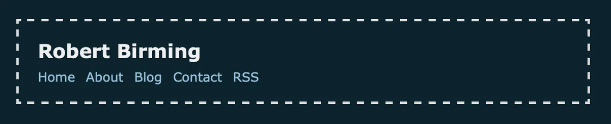
header {
    padding: 0.2rem 1.5rem;
    border: 3px dashed;
}

header .title h1 {
    margin-block-end: 0;
}

header nav p {
    margin-block-start: 0.2em;
}
Accent border

header {
    padding-inline-start: 1.1rem;
    border-inline-start: 2px solid var(--link-color);
}

header .title h1 {
    margin-block-end: 0;
}

header nav p {
    margin-block-start: 0.2em;
}
Avatar

:root {
    --avatar-url: url("https://example.com/your-avatar.jpg");
    --avatar-size: 3rem;
    --avatar-radius: 50%; /* Change to 5px e.g. for square */
}

header {
    display: grid;
    grid-template-columns: auto 1fr;
    align-items: center;
    column-gap: 1rem;
}

header::before {
    content: "";
    grid-column: 1;
    grid-row: 1 / 3;
    width: var(--avatar-size);
    aspect-ratio: 1;
    background: var(--avatar-url) center / cover no-repeat;
    border-radius: var(--avatar-radius);
}

header .title h1 {
    margin-block-end: 0;
}

header nav p {
    margin-block-start: 0.2em;
}
Card

header {
    padding-block: 1rem;
    padding-inline: 1.2rem;
    background: color-mix(in srgb, var(--text-color), var(--background-color) 94%);
    border-radius: 8px;
    text-align: center;
}

header .title h1 {
    margin-block-end: 0;
}

header nav p {
    margin-block-start: 0.7rem;
    padding-block-start: 0.5rem;
    border-block-start: 1px solid color-mix(in srgb, var(--text-color), transparent 80%);
}
Want more? Check out the full Bear Blog library.