Bear Blog image styles
The default Bear Blog theme keeps images plain, just full width and nothing else. That leaves a lot of room to give them some more character.
This page collects small CSS tweaks and variations for images in your posts. Each one works out of the box, but they're just as much meant as a starting point. Mix and match, tweak the values, or use them to learn more about theme styling.
Last updated 6 days, 21 hours ago.
Rounded corners
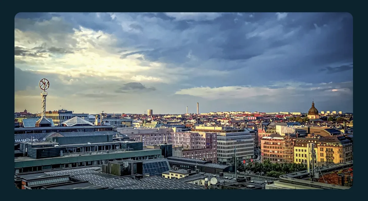
main img {
    border-radius: 12px;
}
Bordered
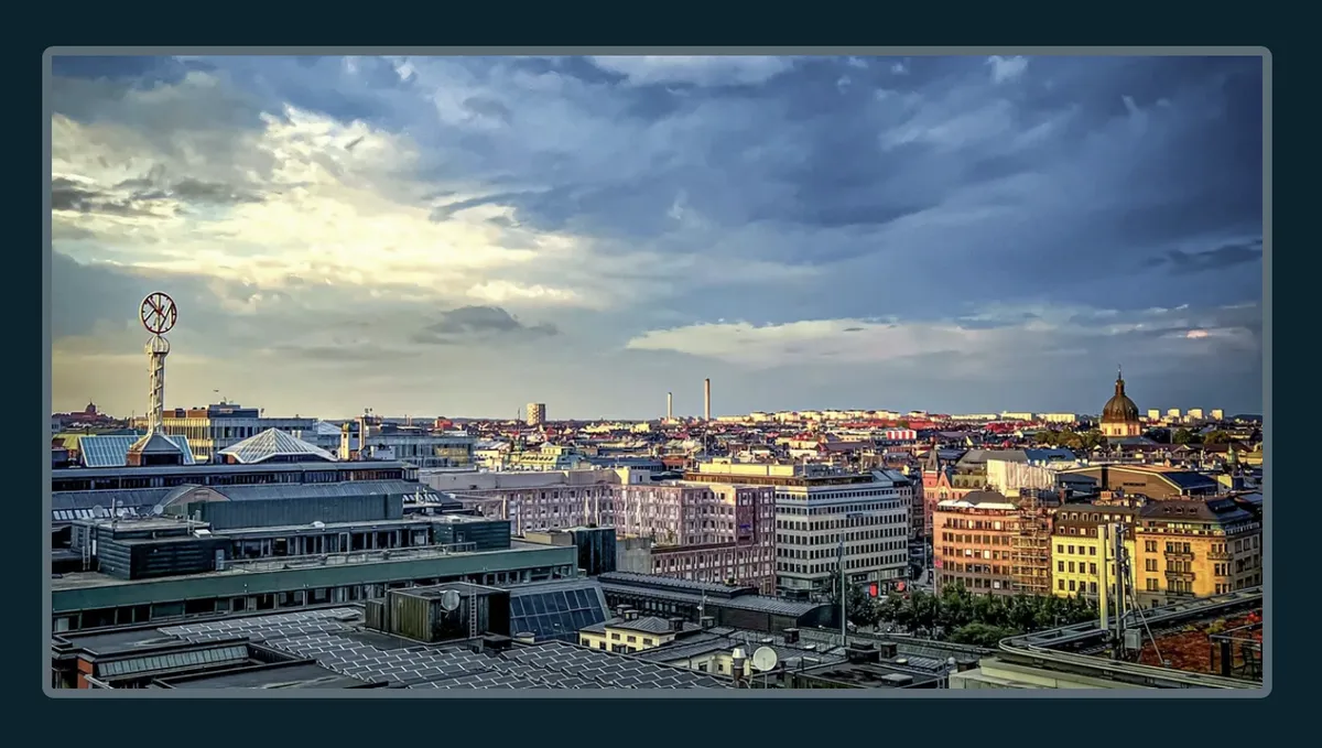
main img {
    border: 5px solid color-mix(in srgb, var(--text-color), transparent 60%);
    border-radius: 6px;
}
Framed
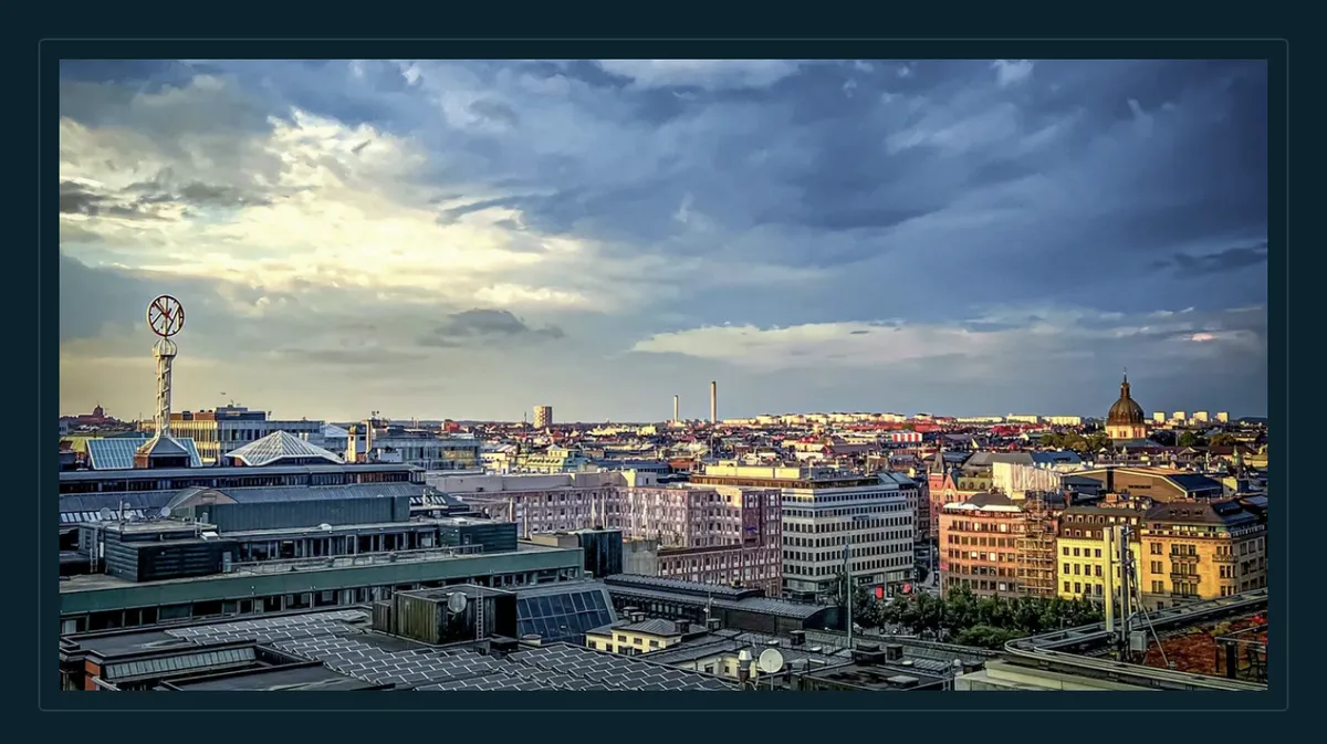
main img {
    padding: 10px;
    background-color: var(--background-color);
    border: 1px solid color-mix(in srgb, var(--text-color), transparent 85%);
}
Shadow
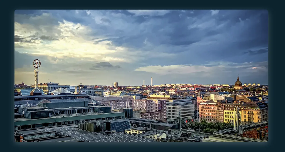
main img {
    border-radius: 6px;
    box-shadow: 0 4px 16px color-mix(in srgb, var(--text-color), transparent 70%);
}
Grayscale on hover
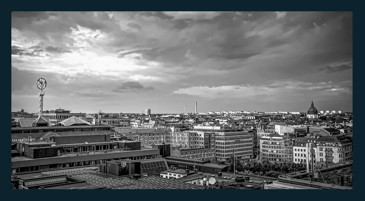
main img {
    filter: grayscale(0%);
    transition: filter 0.2s ease;
}

@media (hover: hover) {
    main img:hover {
        filter: grayscale(100%);
    }
}

@media (prefers-reduced-motion: reduce) {
    main img {
        transition: none;
    }
}
Caption
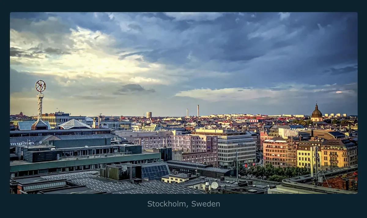
Bear doesn't generate captions automatically, add the figure and figcaption tags directly in your post.
Markup
<figure>

<figcaption>Your caption text.</figcaption>
</figure>
Styles
main figure {
    margin-inline: 0;
}

main figure img {
    margin-block-end: 0;
}

main figure p {
    margin: 0;
}

main figcaption {
    margin-block-start: 0.5em;
    font-size: calc(var(--font-scale) * 0.85);
    color: color-mix(in srgb, var(--text-color), transparent 40%);
    text-align: center;
}
Full bleed
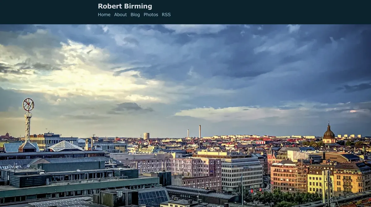
Lets an image break out of the post's text column and stretch wider than the surrounding content.
Markup
<div class="full-bleed">

</div>
Styles
.full-bleed {
    width: 100vw;
    margin-inline-start: 50%;
    transform: translateX(-50%);
}

.full-bleed img {
    display: block;
    width: 100%;
}
Polaroid
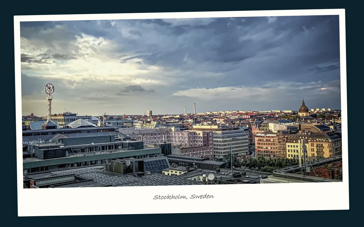
Gives any image a polaroid look, paper border, slight tilt, and an optional caption.
Markup
<div class="polaroid">

<em>Your caption here.</em>
</div>
Styles
.polaroid {
    display: flow-root;
    width: fit-content;
    margin-block: 1.5rem;
    margin-inline: auto;
    padding: 0.7rem 0.7rem 1.3rem;
    background: #fffdf5;
    border-radius: 2px;
    box-shadow: 0 2px 16px rgba(0, 0, 0, 0.15);
    transform: rotate(-1.2deg);
    transition: transform 0.2s ease-out, box-shadow 0.2s ease-out;
}

.polaroid p {
    margin: 0;
}

.polaroid img {
    display: block;
    margin: 0;
    border-radius: 0;
    filter: saturate(0.75) contrast(0.95);
}

.polaroid em {
    display: block;
    margin-block-start: 0.7rem;
    text-align: center;
    font-size: calc(var(--font-scale) * 0.85);
    font-family: "Segoe Script", "Bradley Hand", cursive;
    color: #666;
}

@media (hover: hover) {
    .polaroid:hover {
        transform: rotate(0deg);
        box-shadow: 0 6px 24px rgba(0, 0, 0, 0.2);
    }
}

@media (prefers-reduced-motion: reduce) {
    .polaroid {
        transition: none;
    }
}
Image filters
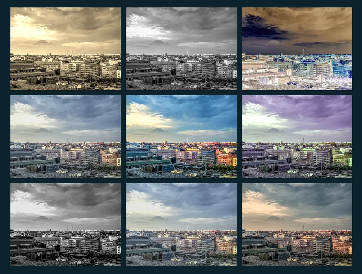
Applies a CSS filter to any image using a # fragment at the end of the URL, a bunch of moods and styles, one # away.
Markup


Styles
img[src*="#sepia"] {
    filter: sepia(1);
}

img[src*="#mono"] {
    filter: grayscale(1);
}

img[src*="#invert"] {
    filter: invert(1);
}

img[src*="#fade"] {
    filter: grayscale(0.2) brightness(1.1) contrast(0.85) saturate(0.8);
}

img[src*="#warm"] {
    filter: saturate(1.3) brightness(1.05) hue-rotate(-10deg);
}

img[src*="#cool"] {
    filter: saturate(0.7) hue-rotate(45deg) brightness(1.08);
}

img[src*="#noir"] {
    filter: grayscale(1) contrast(1.3) brightness(0.9);
}

img[src*="#haze"] {
    filter: brightness(1.15) contrast(0.8) saturate(0.7);
}

img[src*="#dusk"] {
    filter: brightness(0.85) sepia(0.4) saturate(1.2) hue-rotate(-15deg);
}
Hero banner
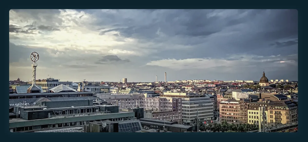
Turns any image into a wide, desaturated banner that comes alive on hover, a simple way to add a cinematic touch to a post or page.
Markup
<div class="hero">

</div>
Styles
.hero img {
    aspect-ratio: 21 / 9;
    object-fit: cover;
    border-radius: 6px;
    box-shadow: 0 2px 12px color-mix(in srgb, var(--text-color), transparent 92%);
    filter: saturate(0.6) contrast(0.95);
    transition: filter 0.4s ease;
}

@media (hover: hover) {
    .hero img:hover {
        filter: saturate(1) contrast(1);
    }
}

@media (prefers-reduced-motion: reduce) {
    .hero img {
        transition: none;
    }
}
Want more? Check out the full Bear Blog library.