Kodiak theme
- Bear Blog library
- Themes
- Kodiak
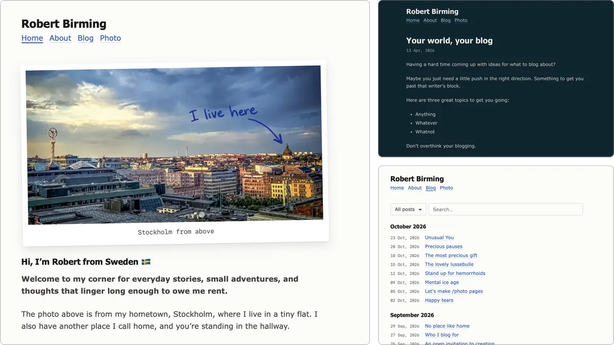
Kodiak is a fully grown take on Bear's default theme. Same bear at first glance, just roomier and a bit easier on the eyes.
Work in progress
Kodiak is brand new and still finding its paws. It's ready to use, but expect small tweaks along the way.
What's different
- Calmer colors: a warm off-white light mode and a softened version of the default's deep teal dark mode.
- Roomier reading: a comfortable line length, a little more breathing room, and headings that stay close to their text.
- Clearer links: a soft underline, so they're easy to spot for everyone.
- Tidier details: code blocks, tables, footnotes, tags, post lists and the subscribe form.
- Default tokens: Bear's own token names, so palettes and add-ons work out of the box.
Markdown tricks
A few extras that turn plain Markdown into something more. Without the theme, they're just regular Markdown.
Image caption: an italic line right under an image.

*Stockholm from above*
Polaroid: add #polaroid to an image, with an optional italic line as caption.

*Sunday, finally*
Frame: add #frame to an image.

Gallery: add class_name: gallery to a post's settings, and put the images on consecutive lines.


Note: start a blockquote with a heading.
> #### Note
> Do not feed the bear.
Breadcrumb: start a page with a numbered list right under its title.
1. [Bear Blog library](/bear-blog-library/)
2. [Themes](/bear-blog-library/#themes)
3. Kodiak
Avatar: start your nav with a linked image ending in #avatar.
[](/)
Post extras
Post navigation: older and newer posts with their titles, shown on posts only. Start Bear's footer directive with:
<div class="post-nav">{{ previous_post }} {{ next_post }}</div>
Upvote: the upvote button becomes a lovely heart with the count beside it, no setup needed.
Plugins
Kodiak includes styles for a few scripts, which you add to Bear's footer directive if you want them:
- Blog archive groups your posts by month, with year filter, search and pagination.
- Aria current marks the current page in your nav.
- Lightbox opens photos in a calm full-screen viewer. Coming soon.
To add one, open its page, copy the full script and paste it into Bear's footer directive, wrapped in script tags.
How to use
Copy the theme styles below and paste them into your Bear theme settings. Everything under "Optional extras" and "Plugin styles" is safe to remove if you don't use it.
Happy blogging! 🐻
Theme styles
/*
* Kodiak — a fully grown Bear theme
* Version 1.0.0 | 2026-10-24
* Robert Birming | robertbirming.com
*/
:root {
color-scheme: light dark;
--width: 65ch;
--font-main: Tahoma, Verdana, sans-serif;
--font-secondary: Verdana, sans-serif;
--font-scale: 1rem;
--background-color: #fcfcfa;
--heading-color: #1c1917;
--text-color: #44403c;
--link-color: #2d63b8;
--visited-color: #7a5ab8;
--code-background-color: color-mix(in srgb, var(--background-color), black 4%);
--code-color: var(--heading-color);
--blockquote-color: #292524;
}
@media (prefers-color-scheme: dark) {
:root {
--background-color: #07262f;
--heading-color: #eceae6;
--text-color: #d4d2cd;
--link-color: #8fc1da;
--visited-color: #b39ddb;
--code-background-color: color-mix(in srgb, var(--background-color), white 6%);
--blockquote-color: #c9c7c2;
}
body {
-webkit-font-smoothing: antialiased;
-moz-osx-font-smoothing: grayscale;
}
}
*,
*::before,
*::after {
box-sizing: border-box;
}
html {
-webkit-text-size-adjust: 100%;
text-size-adjust: 100%;
}
body {
max-width: calc(var(--width) + 2.5rem);
margin: auto;
padding: 2rem 1.25rem;
font-family: var(--font-secondary);
font-size: var(--font-scale);
line-height: 1.65;
overflow-wrap: break-word;
color: var(--text-color);
background-color: var(--background-color);
}
:where(p, ul, ol, blockquote, table) {
margin-block: 1.5em;
}
p:empty {
display: none;
}
h1, h2, h3, h4, h5, h6 {
font-family: var(--font-main);
color: var(--heading-color);
line-height: 1.3;
text-wrap: balance;
}
h1 { font-size: 1.75em; }
h2 { font-size: 1.375em; }
h3 { font-size: 1.125em; }
h4, h5, h6 { font-size: 1em; }
:where(main) :where(h1, h2, h3, h4, h5, h6) {
margin-block: 1.5em 0.7em;
}
:where(main) :where(h1, h2, h3, h4, h5, h6) + * {
margin-block-start: 0;
}
a {
color: var(--link-color);
text-decoration: underline;
text-decoration-thickness: 1px;
text-underline-offset: 0.2em;
text-decoration-color: color-mix(in srgb, currentColor 25%, transparent);
}
:where(main) a:visited {
color: var(--visited-color);
}
@media (hover: hover) {
a:hover {
text-decoration-color: currentColor;
text-decoration-thickness: 0.1em;
}
}
:where(:focus-visible) {
outline: 2px solid var(--link-color);
outline-offset: 2px;
}
:where(ul, ol) {
padding-inline-start: 2em;
}
:where(li) + :where(li) {
margin-block-start: 0.3em;
}
:where(li) > :where(ul, ol, p) {
margin-block: 0.3em;
}
:where(li)::marker {
color: color-mix(in srgb, currentColor 75%, transparent);
}
blockquote {
margin-inline: 0;
padding-inline-start: 1.25em;
border-inline-start: 2px solid color-mix(in srgb, currentColor 40%, transparent);
color: var(--blockquote-color);
font-style: italic;
}
hr {
border: 0;
border-block-start: 1px solid color-mix(in srgb, currentColor 30%, transparent);
margin-block: 2.5em;
}
img {
max-width: 100%;
height: auto;
vertical-align: middle;
border-radius: 4px;
}
figure {
margin-inline: 0;
}
code {
font-family: ui-monospace, monospace;
font-size: 0.875em;
padding: 0.1em 0.3em;
background-color: var(--code-background-color);
color: var(--code-color);
border-radius: 0.25em;
}
pre code {
font-size: inherit;
padding: 0;
background: none;
}
.highlight, .code {
margin-block: 1.5em;
padding: 1em 1.25em;
background-color: var(--code-background-color);
color: var(--code-color);
border-radius: 4px;
overflow-x: auto;
}
:where(.highlight, .code) pre {
margin: 0;
font-family: ui-monospace, monospace;
font-size: 0.875em;
line-height: 1.5;
}
.inline {
width: auto !important;
}
table {
width: 100%;
border-collapse: collapse;
font-variant-numeric: tabular-nums;
}
th, td {
padding: 0.5em 0.75em;
border-block-end: 1px solid color-mix(in srgb, currentColor 15%, transparent);
text-align: start;
}
@media (max-width: 40rem) {
table {
display: block;
overflow-x: auto;
}
}
/* Footnotes */
sup, sub {
line-height: 0;
}
.footnote-ref a {
padding-inline: 0.15em;
text-decoration: none;
}
.footnotes {
margin-block-start: 3em;
padding-block-start: 1.5em;
border-block-start: 1px solid color-mix(in srgb, currentColor 20%, transparent);
font-size: 0.875em;
}
.footnotes ol {
margin-block: 0;
}
.footnote,
.footnote:visited {
margin-inline-start: 0.2rem;
font-size: 0;
color: var(--link-color);
text-decoration: none;
}
.footnote::after {
content: "\21A9\FE0E";
font-size: calc(var(--font-scale) * 0.875);
}
:where(.footnote-ref, .footnotes li) {
scroll-margin-block-start: 2em;
}
:where(.footnote-ref, .footnotes li):target {
background-color: var(--code-background-color);
border-radius: 4px;
}
:where(input, select, textarea, button) {
font: inherit;
}
button {
margin: 0;
cursor: pointer;
}
/* Email signup */
.email-signup {
display: flex;
flex-wrap: wrap;
gap: 0.5em;
max-width: 28em;
}
.email-signup br {
display: none;
}
.email-signup :is(input[type="email"], input[type="submit"]) {
appearance: none;
padding: 0.6em 0.9em !important;
border: 1px solid transparent;
border-radius: 4px;
line-height: 1.3;
}
.email-signup input[type="email"] {
flex: 1 1 14em;
border-color: color-mix(in srgb, currentColor 25%, transparent);
color: inherit;
background-color: transparent !important;
}
.email-signup input[type="email"]::placeholder {
color: color-mix(in srgb, currentColor 70%, transparent);
}
.email-signup input[type="submit"] {
padding-inline: 1.1em !important;
color: var(--background-color);
background-color: var(--link-color);
cursor: pointer;
}
@media (hover: hover) {
.email-signup input[type="submit"]:hover {
background-color: color-mix(in srgb, var(--link-color), var(--heading-color) 20%);
}
}
time {
font-family: ui-monospace, monospace;
font-style: normal;
font-size: 0.875em;
letter-spacing: -0.03em;
color: color-mix(in srgb, currentColor 80%, transparent);
}
header {
margin-block: 0 2.5em;
}
.title {
text-decoration: none;
}
.title h1 {
margin-block: 0;
font-size: 1.5em;
}
nav p {
margin-block: 0.2em 0;
}
nav a {
margin-inline-end: 0.5em;
}
main > :first-child {
margin-block-start: 0;
}
main > :nth-last-child(1 of :not(script, p:empty)) {
margin-block-end: 0;
}
body.post main > h1:first-of-type {
margin-block-end: 0;
}
body.post main > h1:first-of-type + p {
margin-block-start: 0.2em;
}
footer {
margin-block-start: 3em;
text-align: center;
font-size: 0.875em;
}
footer p {
margin-block: 0.5em;
}
/* Blog post list */
.blog-posts {
list-style: none;
padding: 0;
}
.blog-posts li {
display: flex;
align-items: baseline;
gap: 1.25em;
}
.blog-posts span {
flex: none;
}
.blog-posts a {
text-wrap: pretty;
}
p:has(+ .embedded) {
margin-block-end: 0;
}
.embedded {
margin-block-start: 0;
}
/* Tags */
.tags {
display: flex;
flex-wrap: wrap;
gap: 0.25em 0.75em;
font-size: 0.875em;
}
.tags a,
.tags a:visited {
color: color-mix(in srgb, var(--text-color) 80%, transparent);
}
small:has(> .tags) {
font-size: inherit;
}
@media (hover: hover) {
.tags a:hover {
color: var(--link-color);
}
}
/* Optional extras: safe to remove if unused */
/* Avatar
Start your nav with [](/) */
header:has(img[src$="#avatar"]) {
--avatar-size: 3.75em;
position: relative;
min-height: var(--avatar-size);
padding-inline-start: calc(var(--avatar-size) + 1em);
}
header a:has(> img[src$="#avatar"]) {
position: absolute;
inset-block-start: 50%;
inset-inline-start: 0;
translate: 0 -50%;
border-radius: 4px;
}
header img[src$="#avatar"] {
display: block;
width: var(--avatar-size);
aspect-ratio: 1;
object-fit: cover;
border-radius: inherit;
}
/* Upvote button */
#upvote-form .upvote-button {
margin-block-start: 2em;
flex-direction: row;
align-items: center;
gap: 0.35em;
border-radius: 4px;
color: color-mix(in srgb, var(--text-color) 80%, transparent);
font-size: inherit;
line-height: 1;
transition: color 150ms;
}
#upvote-form .upvote-button svg {
display: none;
}
#upvote-form .upvote-button::before {
content: "";
width: 1.15em;
height: 1.15em;
background-color: currentColor;
mask: url("data:image/svg+xml,<svg xmlns='http://www.w3.org/2000/svg' viewBox='0 0 24 24' fill='none' stroke='black' stroke-width='2' stroke-linejoin='round'><path d='M19 14c1.49-1.46 3-3.21 3-5.5A5.5 5.5 0 0 0 16.5 3c-1.76 0-3 .5-4.5 2-1.5-1.5-2.74-2-4.5-2A5.5 5.5 0 0 0 2 8.5c0 2.3 1.5 4.05 3 5.5l7 7Z'/></svg>") center / contain no-repeat;
}
#upvote-form .upvote-button[disabled]::before {
mask-image: url("data:image/svg+xml,<svg xmlns='http://www.w3.org/2000/svg' viewBox='0 0 24 24' fill='black' stroke='black' stroke-width='2' stroke-linejoin='round'><path d='M19 14c1.49-1.46 3-3.21 3-5.5A5.5 5.5 0 0 0 16.5 3c-1.76 0-3 .5-4.5 2-1.5-1.5-2.74-2-4.5-2A5.5 5.5 0 0 0 2 8.5c0 2.3 1.5 4.05 3 5.5l7 7Z'/></svg>");
}
#upvote-form .upvote-count {
margin-block-start: 0;
font-size: inherit;
translate: 0 0.05em;
}
@media (hover: hover) {
#upvote-form .upvote-button:not([disabled]):hover {
color: var(--link-color);
}
}
#upvote-form .upvote-button[disabled] {
color: #b84a33 !important;
cursor: default;
}
@media (prefers-color-scheme: dark) {
#upvote-form .upvote-button[disabled] {
color: #f0907c !important;
}
}
@media (prefers-reduced-motion: reduce) {
#upvote-form .upvote-button {
transition: none;
}
}
/* Previous and next post
In Bear's footer directive, start with:
<div class="post-nav">{{ previous_post }} {{ next_post }}</div> */
.post-nav {
display: none;
}
.post .post-nav {
display: flex;
justify-content: space-between;
gap: 1.5em;
margin-block-end: 2em;
padding-block: 1.25em;
border-block: 1px solid color-mix(in srgb, currentColor 20%, transparent);
text-align: start;
}
.post-nav p {
display: contents;
}
.post-nav a {
display: flex;
flex-direction: column;
gap: 0.3rem;
max-width: 48%;
font-size: 0;
text-decoration: none;
pointer-events: none;
}
.post-nav .next-post {
margin-inline-start: auto;
align-items: flex-end;
text-align: end;
}
.post-nav a::before {
font-size: calc(var(--font-scale) * 0.875);
line-height: 1.3;
color: color-mix(in srgb, var(--text-color) 80%, transparent);
}
.post-nav .previous-post::before {
content: "\2190\00a0Older" / "";
}
.post-nav .next-post::before {
content: "Newer\00a0\2192" / "";
}
.post-nav a::after {
content: attr(title);
font-size: var(--font-scale);
line-height: 1.3;
text-decoration: underline;
text-decoration-thickness: 1px;
text-underline-offset: 0.2em;
text-decoration-color: color-mix(in srgb, currentColor 40%, transparent);
text-wrap: pretty;
pointer-events: auto;
}
@media (hover: hover) {
.post-nav a:hover::after {
text-decoration-color: currentColor;
text-decoration-thickness: 0.1em;
}
}
/* Breadcrumb
Start a page with a numbered list right under its title */
body.page main > h1:has(+ ol) {
margin-block-end: 0;
}
body.page main > h1 + ol {
display: flex;
flex-wrap: wrap;
margin-block-start: 0.2em;
padding: 0;
list-style: none;
font-size: 0.875em;
color: color-mix(in srgb, var(--text-color) 80%, transparent);
}
body.page main > h1 + ol li {
margin: 0;
}
body.page main > h1 + ol li + li::before {
content: "/";
content: "/" / "";
padding-inline: 0.5em;
}
body.page main > h1 + ol a,
body.page main > h1 + ol a:visited {
color: inherit;
}
@media (hover: hover) {
body.page main > h1 + ol a:hover {
color: var(--link-color);
}
}
/* Note
Start a blockquote with a heading: > #### Note */
blockquote:has(> :is(h1, h2, h3, h4, h5, h6):first-child) {
padding: 1em 1.25em;
border: 0;
border-radius: 4px;
color: var(--text-color);
background-color: var(--code-background-color);
font-style: normal;
}
blockquote > :is(h1, h2, h3, h4, h5, h6):first-child {
margin-block: 0 0.4em;
font-size: 1em;
}
blockquote:has(> :is(h1, h2, h3, h4, h5, h6):first-child) > :last-child {
margin-block-end: 0;
}
/* Image caption
Add an *italic line* directly under an image */
:where(p > img + em, p > img + br + em) {
display: block;
margin-block-start: 0.6em;
font-size: 0.875em;
font-style: normal;
line-height: 1.5;
text-wrap: pretty;
color: color-mix(in srgb, currentColor 80%, transparent);
}
/* Polaroid
Add #polaroid to an image, with an optional *italic line* below:
 */
p:has(> img[src$="#polaroid"]) {
--paper: #fff;
width: fit-content;
max-width: 100%;
margin-inline: auto;
padding: 0.75em 0.75em 3em;
background-color: var(--paper);
box-shadow: 0 1px 2px rgb(0 0 0 / 0.08), 0 8px 20px rgb(0 0 0 / 0.1);
rotate: -1deg;
}
@media (prefers-color-scheme: dark) {
p:has(> img[src$="#polaroid"]) {
--paper: #e7e4dd;
}
}
p:has(> img[src$="#polaroid"]):has(> em) {
padding-block-end: 0.75em;
}
p:has(> img[src$="#polaroid"]) > img {
display: block;
border-radius: 0;
}
p:has(> img[src$="#polaroid"]) > br {
display: none;
}
p:has(> img[src$="#polaroid"]) > em {
display: block;
min-height: 2.5em;
margin: 0;
padding-block-start: 0.75em;
font-family: ui-monospace, monospace;
letter-spacing: -0.03em;
font-size: 0.875em;
line-height: 1.4;
text-align: center;
color: #57534e;
contain: inline-size;
}
/* Frame
Add #frame to an image:  */
img[src$="#frame"] {
padding: 0.5em;
border: 1px solid color-mix(in srgb, currentColor 15%, transparent);
background-color: var(--code-background-color);
}
/* Gallery
Add class_name: gallery to a post's settings,
and put images on consecutive lines */
body.gallery main p:has(> img, > a > img) {
display: grid;
grid-template-columns: repeat(auto-fill, minmax(min(10em, 100%), 1fr));
gap: 0.5em;
}
body.gallery main p:has(> img, > a > img) > br {
display: none;
}
body.gallery main p:has(> img, > a > img) > em {
grid-column: 1 / -1;
}
body.gallery main p > :is(img, a > img) {
display: block;
width: 100%;
aspect-ratio: 4 / 3;
object-fit: cover;
}
/* Plugin styles: only needed with their scripts */
/* Lightbox
Add lightbox.js in a script tag in Bear's footer directive */
main img[role="button"] {
cursor: zoom-in;
}
.lightbox[open] {
display: grid;
place-items: center;
}
.lightbox {
width: 100%;
max-width: none;
height: 100%;
max-height: none;
margin: 0;
padding: 1rem;
border: 0;
background-color: color-mix(in srgb, var(--background-color) 95%, transparent);
}
.lightbox:focus {
outline: none;
}
.lightbox::backdrop {
background: none;
}
html:has(.lightbox[open]) {
overflow: hidden;
}
.lightbox-image {
max-height: calc(100dvh - 6rem);
object-fit: contain;
}
.lightbox :is(.lightbox-close, .lightbox-prev, .lightbox-next) {
position: fixed;
width: 2.75rem;
height: 2.75rem;
border: 0;
border-radius: 999px;
font-size: 1.25em;
line-height: 1;
color: color-mix(in srgb, var(--text-color) 80%, transparent);
background-color: color-mix(in srgb, var(--background-color) 70%, transparent);
}
.lightbox-close {
inset-block-start: 1rem;
inset-inline-end: 1rem;
}
.lightbox-prev,
.lightbox-next {
inset-block-start: 50%;
translate: 0 -50%;
}
.lightbox-prev {
inset-inline-start: 1rem;
}
.lightbox-next {
inset-inline-end: 1rem;
}
.lightbox-count {
position: fixed;
inset-block-end: 1rem;
inset-inline: 0;
margin: 0;
text-align: center;
font-size: 0.875em;
font-variant-numeric: tabular-nums;
color: color-mix(in srgb, var(--text-color) 80%, transparent);
}
@media (hover: hover) {
.lightbox :is(.lightbox-close, .lightbox-prev, .lightbox-next):hover {
color: var(--link-color);
}
}
@media (prefers-reduced-motion: no-preference) {
.lightbox[open] {
animation: lightbox-in 150ms ease-out;
}
}
@keyframes lightbox-in {
from { opacity: 0; }
}
/* Blog archive
Add blog-archive.js in a script tag in Bear's footer directive */
#blog-archive > p:first-child {
display: flex;
flex-wrap: wrap;
gap: 0.5em;
}
:is(#blog-archive-year, #blog-archive-search, #blog-archive-pagination button) {
appearance: none;
padding: 0.6em 0.9em;
border: 1px solid color-mix(in srgb, currentColor 25%, transparent);
border-radius: 4px;
line-height: 1.3;
color: inherit;
background-color: transparent;
}
#blog-archive-year {
padding-inline-end: 2.25em;
background-image:
linear-gradient(45deg, transparent 50%, currentColor 50%),
linear-gradient(135deg, currentColor 50%, transparent 50%);
background-position: calc(100% - 1.2em) 55%, calc(100% - 0.85em) 55%;
background-size: 0.35em 0.35em;
background-repeat: no-repeat;
cursor: pointer;
}
#blog-archive-search {
flex: 1 1 12em;
}
#blog-archive-search::placeholder {
color: color-mix(in srgb, currentColor 70%, transparent);
}
#blog-archive-pagination {
display: flex;
align-items: center;
justify-content: space-between;
gap: 1em;
margin-block-start: 2em;
}
#blog-archive-prev::before {
content: "\2190\00a0";
content: "\2190\00a0" / "";
}
#blog-archive-next::after {
content: "\00a0\2192";
content: "\00a0\2192" / "";
}
#blog-archive-info,
#blog-archive-empty {
font-size: 0.875em;
color: color-mix(in srgb, var(--text-color) 80%, transparent);
}
@media (hover: hover) {
#blog-archive-pagination button:not(:disabled):hover {
border-color: var(--link-color);
color: var(--link-color);
}
}
#blog-archive-pagination button:disabled {
opacity: 0.4;
cursor: default;
}
/* Aria current
Add aria-current.js in a script tag in Bear's footer directive */
nav a[aria-current="page"] {
text-decoration-color: currentColor;
text-decoration-thickness: 0.1em;
}