Bear Blog Guestbooks styles
Guestbooks is a small embeddable widget that makes it easy to add a guestbook to any Bear Blog page.
It ships with its own default look, but a few CSS tweaks make it feel like a native part of your theme instead of a bolted-on widget. It also includes support for the optional "Proof of Work" and "Verification Question" features.
Preview
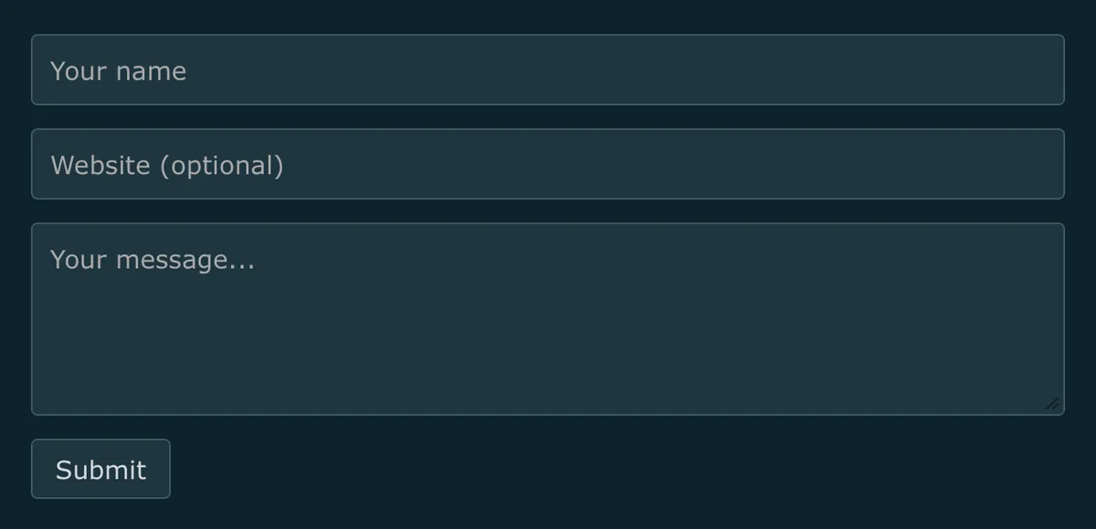
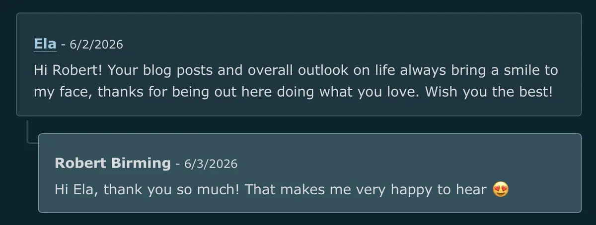
Styles
input,
select,
textarea {
  font: inherit;
  color: var(--text-color);
}

#guestbooks___guestbook-form-container {
  margin-block: 1.8rem;
}

#guestbooks___guestbook-form-container form {
  display: flex;
  flex-direction: column;
  gap: 0.9rem;
  margin: 0;
}

#guestbooks___guestbook-form-container .guestbooks___input-container {
  box-sizing: border-box;
  width: 100%;
  margin: 0;
}

#guestbooks___guestbook-form-container :is(input, textarea, button, select) {
  font: inherit;
  color: inherit;
  appearance: none;
}

#guestbooks___guestbook-form-container :is(input[type="text"], input[type="email"], input[type="url"], textarea, select) {
  display: block;
  box-sizing: border-box;
  width: 100%;
  max-width: 100%;
  padding-block: 0.55rem;
  padding-inline: 0.7rem;
  background-color: var(--code-background-color);
  border: 1px solid color-mix(in srgb, var(--text-color), transparent 75%);
  border-radius: 2px;
}

#guestbooks___guestbook-form-container textarea {
  min-height: 7.5em;
  resize: vertical;
}

#guestbooks___guestbook-form-container :is(input, textarea, select):focus-visible {
  outline: 2px solid var(--link-color);
  outline-offset: 2px;
}

#guestbooks___guestbook-form-container :is(button, input[type="submit"]) {
  align-self: flex-start;
  padding-block: 0.35rem;
  padding-inline: 0.9rem;
  background-color: var(--code-background-color);
  border: 1px solid color-mix(in srgb, var(--text-color), transparent 75%);
  border-radius: 2px;
  cursor: pointer;
}

@media (hover: hover) {
  #guestbooks___guestbook-form-container :is(button, input[type="submit"]):hover {
    color: var(--background-color);
    background-color: var(--text-color);
    border-color: var(--text-color);
  }
}

#guestbooks___guestbook-form-container :is(button, input[type="submit"]):focus-visible {
  color: var(--background-color);
  background-color: var(--text-color);
  border-color: var(--text-color);
  outline: 2px solid var(--link-color);
  outline-offset: 2px;
}

#guestbooks___guestbook-form-container :is(button, input[type="submit"]):disabled {
  opacity: 0.7;
  cursor: not-allowed;
}

#guestbooks___guestbook-form-container input[type="checkbox"] {
  appearance: none;
  display: inline-block;
  width: 1.1rem;
  height: 1.1rem;
  margin: 0;
  background-color: var(--code-background-color);
  border: 1px solid color-mix(in srgb, var(--text-color), transparent 75%);
  border-radius: 3px;
  cursor: pointer;
  position: relative;
}

#guestbooks___guestbook-form-container input[type="checkbox"]:checked {
  background-color: var(--link-color);
  border-color: var(--link-color);
}

#guestbooks___guestbook-form-container input[type="checkbox"]:checked::after {
  content: "";
  position: absolute;
  left: 0.32rem;
  top: 0.14rem;
  width: 0.28rem;
  height: 0.55rem;
  border: solid var(--background-color);
  border-width: 0 2px 2px 0;
  transform: rotate(45deg);
}

#guestbooks___guestbook-form-container label:has(input[type="checkbox"]) {
  display: flex;
  align-items: center;
  gap: 0.5rem;
  font: inherit;
  color: var(--text-color);
  cursor: pointer;
}

#guestbooks___guestbook-form-container input[type="checkbox"]:focus-visible {
  outline: 2px solid var(--link-color);
  outline-offset: 3px;
}

#guestbooks___challenge-answer-container:empty {
  display: none;
}

#guestbooks___challenge-answer-container {
  display: flex;
  flex-direction: column;
  gap: 0.4rem;
  margin-block-start: -1rem;
}

#guestbooks___challenge-answer-container input {
  margin-block-start: 0.3rem !important;
}

#guestbooks___challenge-answer-container * {
  margin: 0;
}

#guestbooks___guestbook-messages-header {
  display: flex;
  align-items: center;
  gap: 0.4em;
  margin-block: 1.8rem 1rem;
}

#guestbooks___guestbook-messages-header::before {
  content: "💬";
  transform: translateY(1px);
}

#guestbooks___guestbook-messages-container > div {
  margin-block: 1.2em;
  padding-block: 1em;
  padding-inline: 1.2em;
  background-color: var(--code-background-color);
  border: 1px solid color-mix(in srgb, var(--text-color), transparent 75%);
  border-radius: 2px;
}

#guestbooks___guestbook-messages-container :is(blockquote, p) {
  margin: 0.35em 0 0;
  padding: 0;
  border: 0;
  background: none;
  font-style: normal;
  color: inherit;
}

#guestbooks___guestbook-messages-container blockquote::before {
  content: none;
}

#guestbooks___guestbook-messages-container time {
  color: color-mix(in srgb, var(--text-color), transparent 45%);
  white-space: nowrap;
}

#guestbooks___guestbook-messages-container a {
  color: var(--link-color);
}

#guestbooks___guestbook-messages-container a:visited {
  color: var(--visited-color);
}

#guestbooks___guestbook-messages-container .guestbook-message-reply {
  position: relative;
  margin-block: 0.9rem 0.2rem;
  margin-inline-start: 1.6rem;
  padding-block: 0.9em;
  padding-inline: 1.1em;
  background-color: color-mix(in srgb, var(--link-color) 18%, var(--code-background-color));
  border: 1px solid color-mix(in srgb, var(--link-color) 30%, color-mix(in srgb, var(--text-color), transparent 75%));
  border-radius: 2px;
}

#guestbooks___guestbook-messages-container .guestbook-message-reply::before {
  content: "";
  position: absolute;
  inset-block-start: -1rem;
  inset-inline-start: -0.9rem;
  width: 0.7rem;
  height: 1.6rem;
  border-inline-start: 2px solid color-mix(in srgb, var(--text-color), transparent 75%);
  border-block-end: 2px solid color-mix(in srgb, var(--text-color), transparent 75%);
  border-end-start-radius: 2px;
  opacity: 0.8;
}

#guestbooks___guestbook-made-with {
  margin-block-start: 0.5em;
}
Want more? Check out the full Bear Blog library.